
This is a real Blueprint. Delivered with Brand Authority, the highest tier from Rink®.
You are looking at the operating system of a brand, not a presentation of it. Everything below is constructed, measured and transferable. Where something has not been built or measured yet, that is stated rather than presenting it as finished.
ETA Intel · The Blueprint
ETA Intel brand authority.
This is The Blueprint: the environment that documents the Brand Authority deliverable.
The complete documentation: the logo, the identity system built on it, and the commercial and technical infrastructure that carries it, the digital headquarters, page blueprints, commercial message, sales engine, and technical status. Where something is not yet built or not yet measured, this page says so rather than presenting it as finished.
Last verified 8 August 2026
Logo variants
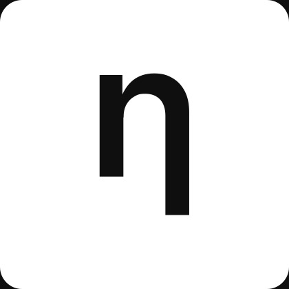
Every mark in this system is monochrome already: ink on a light surface, or its inverse in surface tone on a dark one. There is no separate colour build and no separate black-and-white build, black and white are the same two files used everywhere.



SVG is the master, lossless at any size and used for the previews above, every other format on this page is generated from it. PNG carries transparency for general use. WEBP is a web-optimised raster at 1.5x. JPG is flattened onto an opaque background at 4x, largest file, no transparency. Two print-ready exports are still open, EPS and PDF; neither was available at the time of writing.
Construction
- Icon viewBox
- 0 0 104.93 104.93
- Horizontal lockup viewBox
- 0 0 450.95 104.93
- Icon radius, standalone object
- 8px (7.6% of the edge)
- Interface radius, in-page elements
- 4px
- Horizontal lockup ratio
- 4.30 : 1
- Badge aspect
- 1 : 1
- Layout grid
- 8pt soft grid, 12 columns
Two radii, two different things. 8px is the icon’s own construction, used when the badge stands alone as an object (the mark itself, an avatar, a favicon). 4px is the radius for small interface elements inside a page, buttons and chips such as the download links on this page, matching the site’s existing 4/8/12px radius scale rather than borrowing the icon’s own.
Color values
Ink and surface are the two colours the logo files themselves carry. The rest of this table is the neutral scale the same page and component system is built on, plus the one functional colour: green, reserved for verification and confirmation states.
The brand carries a true neutral print black, Ink at #0F0F0F, so it stays press independent. Screen text runs on slate-900 at #0F172A for softer readability. They are deliberately different, and only the mark is called Ink.
Ink (logo)
#0F0F0F
- RGB
- 15, 15, 15
- CMYK*
- 0/0/0/94
- Pantone*
- Black 6 C 95.5%
Badge fill, both logo variants
Surface (logo mark)
#FFFFFF
- RGB
- 255, 255, 255
- CMYK*
- 0/0/0/0
- Pantone*
- No spot match
Icon glyph inside the badge, and the badge fill on the white/inverse variant
Slate (text)
#0F172A
- RGB
- 15, 23, 42
- CMYK*
- 64/45/0/84
- Pantone*
- 7547 C 97.9%
Headings and primary text (slate-900)
Charcoal (body)
#475569
- RGB
- 71, 85, 105
- CMYK*
- 32/19/0/59
- Pantone*
- 7545 C 98.5%
Body copy (slate-600)
Steel (muted)
#94A3B8
- RGB
- 148, 163, 184
- CMYK*
- 20/11/0/28
- Pantone*
- 535 C 98.3%
Eyebrows, labels, secondary text (slate-400)
Silver (hairline)
#E2E8F0
- RGB
- 226, 232, 240
- CMYK*
- 6/3/0/6
- Pantone*
- 656 C 98.7%
Borders, dividers (slate-200)
Surface
#F8FAFC
- RGB
- 248, 250, 252
- CMYK*
- 2/1/0/1
- Pantone*
- No spot match
Page and card surface (slate-50)
White
#FFFFFF
- RGB
- 255, 255, 255
- CMYK*
- 0/0/0/0
- Pantone*
- No spot match
Base surface
Verified (green)
#047857
- RGB
- 4, 120, 87
- CMYK*
- 97/0/28/53
- Pantone*
- 341 C 98.8%
Confirmation, verification, success state (emerald-700). The only functional color in the system
| Name | Hex | RGB | CMYK* | Pantone* | |
|---|---|---|---|---|---|
Ink (logo) Badge fill, both logo variants | #0F0F0F | 15, 15, 15 | 0/0/0/94 | Black 6 C 95.5% | |
Surface (logo mark) Icon glyph inside the badge, and the badge fill on the white/inverse variant | #FFFFFF | 255, 255, 255 | 0/0/0/0 | No spot match | |
Slate (text) Headings and primary text (slate-900) | #0F172A | 15, 23, 42 | 64/45/0/84 | 7547 C 97.9% | |
Charcoal (body) Body copy (slate-600) | #475569 | 71, 85, 105 | 32/19/0/59 | 7545 C 98.5% | |
Steel (muted) Eyebrows, labels, secondary text (slate-400) | #94A3B8 | 148, 163, 184 | 20/11/0/28 | 535 C 98.3% | |
Silver (hairline) Borders, dividers (slate-200) | #E2E8F0 | 226, 232, 240 | 6/3/0/6 | 656 C 98.7% | |
Surface Page and card surface (slate-50) | #F8FAFC | 248, 250, 252 | 2/1/0/1 | No spot match | |
White Base surface | #FFFFFF | 255, 255, 255 | 0/0/0/0 | No spot match | |
Verified (green) Confirmation, verification, success state (emerald-700). The only functional color in the system | #047857 | 4, 120, 87 | 97/0/28/53 | 341 C 98.8% |
CMYK is calculated from sRGB, not colour-managed or print-proofed.
*Pantone is the nearest Pantone Coated match by RGB distance, cross-checked across two independent converters and shown with their match percentage. It is a starting point for proofing, not a certified match, confirm against a physical Pantone book before print production. The near-white entries carry no spot match: Pantone’s coated library has no true paper-white swatch, spec those as unprinted substrate instead.
Favicon and app icon
Three different consumers, three different rules. The browser tab shows whatever you give it, untouched, which is why it is the mark on its own below, no badge: at 16px a full badge reads as a dark smudge, the bare glyph at full height stays legible. iOS and Android do not show things untouched: both apply their own mask on top of the icon, so a badge that carries its own rounded corners gets rounded twice, or shows a background colour in the gap. The badge's own construction (8px radius, see Construction) is correct as documented and unchanged for the logo itself. The Apple and Android files below are separate, full-bleed builds with no corner radius of their own, built specifically so each platform's own mask has nothing to clip incorrectly.
Browser tab
ICO, multi-size
16, 32, and 48px bundled in one file, the universal fallback.

16×16

32×32

48×48
SVG, scalable, theme-aware
Mark only, no badge, scaled to full height. Two files, the browser switches between them on its own based on the system colour scheme, neither one carries a background so each only reads correctly against its own theme.


Apple touch icon

180 × 180, full bleed, no corner radius of its own. iOS applies its own mask on top.
PWA web manifest

Maskable
Full bleed square, same shape as "Any". An OS launcher may crop it to a circle or squircle at runtime, the glyph stays clear of that crop (see the note below).

The glyph sits well inside the safe zone Android requires (a centred circle 80% of the icon size): measured corner-to-corner, the glyph reaches about 72% of the way to that boundary, so the maskable build needed a full-bleed background but no repositioning of the mark itself.
Usage rules
- Minimum height, wordmark: 24px digital. That is the smallest it is used at in production today, in the site footer.
- Minimum size, icon mark alone: 16px, the favicon floor.
- Clear space: keep at least 8px of empty margin (one corner-radius unit) on every side, more where the layout allows.
- Use the black variant on light surfaces, the white variant on dark ones. Do not place either on a mid-tone background where the contrast breaks down.
- Do not recolor the mark. Ink and surface are the only two colors it carries.
- Do not rotate, skew, or stretch it. The badge is always a 1:1 square with a 8px corner radius.
- Do not add a drop shadow, outline, or effect not shown on this page.
- Do not separate the wordmark from the badge inside a lockup. The icon mark on its own is the only approved standalone use of the badge.
Download everything
Every file on this page in one archive: four logo variants in SVG, PNG, WEBP, and JPG, the full favicon and app icon set, and the colour values as JSON.
Download logo package (.zip)106.4 KB · 28 files
Typography
The type scale as it already runs across etaintel.com, not a new scale built for this page. Every row below is the exact class set used live in production, cited from source.
Heading 1
32 / 36 / 48px · 700 · tight
The ETA Intel logo system.
PageHero.tsx
Heading 2
24 / 30px · 700 · tight
Logo variants
ContentSection.tsx
Body
16 / 18px · 400 · relaxed
Ink and surface are the two colours the logo files themselves carry.
PageHero.tsx
Eyebrow / label
10px · 400 · uppercase · 0.12em
Brand
PageHero.tsx, ~95 occurrences sitewide
Caption
11px · 400 · relaxed
One file, all three sizes.
brand pages and throughout the site
Monospace / data
12 to 13px · mono · secondary or primary
144.93 · #0F0F0F
EditionPageBlock.tsx, FeaturedProfileView.tsx
Button / UI label
14px · 500
Download
RequestForm.tsx and 7 other files, identical string
Icon set
Eight basic marks built on the icon’s own grid: same canvas proportions, same stroke weight as the wordmark, round caps and joins throughout. Verified is the one icon that carries colour, the system’s only functional green.

Same 104.93 unit canvas and 12.5% module grid as the icon mark, see Construction. Stroke weight is 8.64px, matching the wordmark’s own strokes, so the set reads as one family rather than eight unrelated pictograms. Construction.



















Grid system
8pt soft grid, 12 columns, the same grid this page itself is built on. Four layouts already in use across etaintel.com, not new patterns invented for this page.
12, full width
brand-authority/page.tsx sections
6 / 6, two columns
advertise/page.tsx
4 / 4 / 4, three columns
FeatureGrid.tsx
3 / 9, sidebar and content
about/corrections/page.tsx, titles/[slug]/page.tsx
Columns collapse to full width below the layout’s own breakpoint rather than compressing, matching how every grid on the site already behaves.
Photography rules
- Aspect ratio: 3:2, cropped with object-cover. Same ratio as every title card across the network.
- Subject: real facilities and hardware, documentary style. No staged lifestyle photography, no people as the subject.
- Light: golden hour or blue hour, natural and directional, never flat studio lighting.
- No image available: falls back to a neutral slate surface, never a placeholder graphic or a stock silhouette.
- Keep the horizon and the primary subject inside the frame at every crop width, do not zoom past what the composition can lose.
- One photograph, one subject. Do not composite or collage multiple scenes into a single card image.
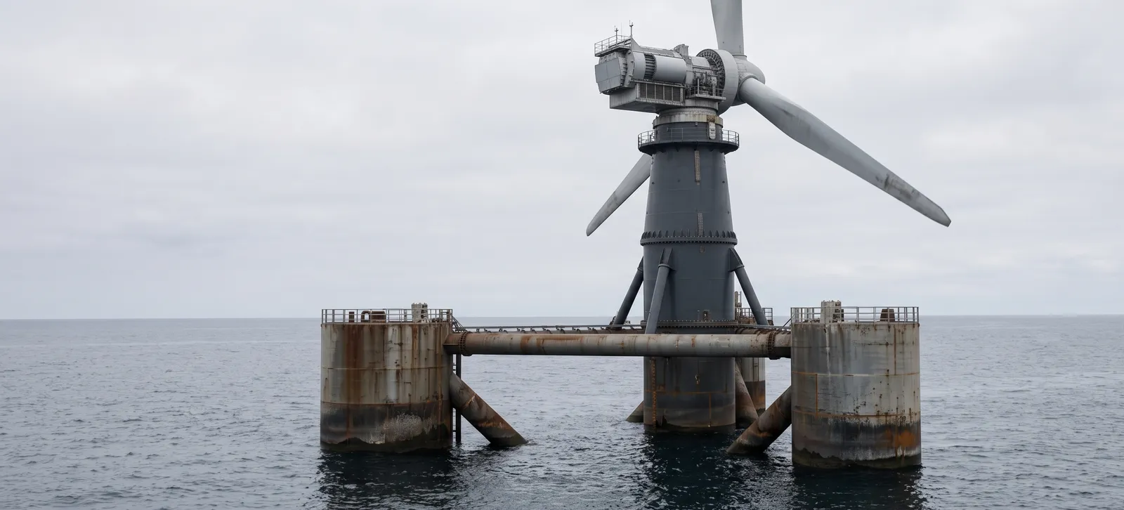
Correct. Full composition, horizon and subject intact.
Incorrect. Zoomed and off centre, the subject and horizon are lost.
Same source photograph, /titles/floatingwindindex.webp, cropped two ways for comparison.
Design tokens
Colour, typography, spacing, grid, and radius as one machine-readable file, generated from the exact values documented on this page. A build can import it directly rather than re-typing any of it by hand.
{
  "system": "ETA Intel identity system",
  "updated": "2026-08-07",
  "note": "Generated from the same values documented on /brand. Font sizes are given in rem assuming a 16px root, matching the site's own Tailwind setup.",
  "color": {
    "ink-logo": {
      "value": "#0F0F0F",
      "usage": "Badge fill, both logo variants"
    },
    "surface-logo-mark": {
      "value": "#FFFFFF",
      "usage": "Icon glyph inside the badge, and the badge fill on the white/inverse variant"
    },
    "ink-text": {
      "value": "#0F172A",
      "usage": "Headings and primary text (slate-900)"
    },
    "charcoal-body": {
      "value": "#475569",
      "usage": "Body copy (slate-600)"
    },
    "steel-muted": {
      "value": "#94A3B8",
      "usage": "Eyebrows, labels, secondary text (slate-400)"
    },
    "silver-hairline": {
      "value": "#E2E8F0",
      "usage": "Borders, dividers (slate-200)"
    },
    "surface": {
      "value": "#F8FAFC",
      "usage": "Page and card surface (slate-50)"
    },
    "white": {
      "value": "#FFFFFF",
      "usage": "Base surface"
    },
    "verified-green": {
      "value": "#047857",
      "usage": "Confirmation, verification, success state (emerald-700). The only functional color in the system"
    }
  },
  "typography": {
    "fontFamily": {
      "sans": [
        "Inter",
        "system-ui",
        "sans-serif"
      ],
      "mono": [
        "ui-monospace",
        "SFMono-Regular",
        "monospace"
      ]
    },
    "heading1": {
      "fontSize": {
        "base": "2rem",
        "sm": "2.25rem",
        "lg": "3rem"
      },
      "fontWeight": 700,
      "lineHeight": 1.1,
      "letterSpacing": "tight",
      "fontFamily": "sans"
    },
    "heading2": {
      "fontSize": {
        "base": "1.5rem",
        "lg": "1.875rem"
      },
      "fontWeight": 700,
      "letterSpacing": "tight",
      "fontFamily": "sans"
    },
    "body": {
      "fontSize": {
        "base": "1rem",
        "lg": "1.125rem"
      },
      "fontWeight": 400,
      "lineHeight": "relaxed",
      "fontFamily": "sans"
    },
    "label": {
      "fontSize": "0.625rem",
      "fontWeight": 400,
      "textTransform": "uppercase",
      "letterSpacing": "0.12em",
      "fontFamily": "sans"
    },
    "caption": {
      "fontSize": "0.6875rem",
      "fontWeight": 400,
      "lineHeight": "relaxed",
      "fontFamily": "sans"
    },
    "data": {
      "fontSize": "0.75rem",
      "fontWeight": 400,
      "fontFamily": "mono"
    },
    "button": {
      "fontSize": "0.875rem",
      "fontWeight": 500,
      "fontFamily": "sans"
    }
  },
  "spacing": {
    "unit": "8px",
    "scale": {
      "1": "8px",
      "2": "16px",
      "3": "24px",
      "4": "32px",
      "5": "40px",
      "6": "48px",
      "8": "64px",
      "10": "80px",
      "12": "96px",
      "16": "128px"
    }
  },
  "grid": {
    "columns": 12,
    "gap": "24px",
    "maxWidth": "1200px",
    "breakpoints": {
      "sm": "640px",
      "md": "768px",
      "lg": "1024px",
      "xl": "1280px"
    }
  },
  "radius": {
    "interface": "4px",
    "iconStandalone": "8px",
    "large": "12px"
  }
}
Digital templates
Four starting points, ready to open and fill in. No new layout system, the same colours, type, and spacing as the rest of this page.


Writing prompts
The verbal layer of the system. The visual rules hold the brand together across suppliers. These prompts do the same for language. Each one carries the ETA Intel voice and the limits a writer keeps to. Copy the prompt that matches your task. A human edits before anything is published.
Marketing and audience
Magazine edition announcement
Write for ETA Intel, an independent B2B trade publisher for frontier hardware. Voice: factual, restrained, en-GB, engineering register. No hype, no superlatives, no urgency, no exclamation marks, no em-dashes, no emoji. Attribute every claim to a source. Verification means a source was confirmed at a point in time, never an endorsement or a guarantee. Independence is the position: no investors, no advertiser control. A human edits before anything is published.

Task: write the announcement email for a new ETA Intel Magazine edition.
Input you provide: the edition period, and three to five highlights, each as the market plus the single development that matters.
Output: a plain subject line, one opening line that names the edition, a scannable list with each highlight in one factual sentence, and one closing line that links to the web edition. Do not summarise the whole edition. The link carries the depth. Keep the whole email under 150 words.
LinkedIn post from a development
Write for ETA Intel, an independent B2B trade publisher for frontier hardware. Voice: factual, restrained, en-GB, engineering register. No hype, no superlatives, no urgency, no exclamation marks, no em-dashes, no emoji. Attribute every claim to a source. Verification means a source was confirmed at a point in time, never an endorsement or a guarantee. Independence is the position: no investors, no advertiser control. A human edits before anything is published.

Task: turn one market development into a LinkedIn post.
Input you provide: the development, the market, and the source.
Output: one factual opening statement, then two or three sentences of plain context and why it matters to engineers, developers or investors, then one line linking to the title for the depth. No question to the audience, no call to subscribe, no closing string of hashtags. Name the source in the post.
New title or tracker milestone
Write for ETA Intel, an independent B2B trade publisher for frontier hardware. Voice: factual, restrained, en-GB, engineering register. No hype, no superlatives, no urgency, no exclamation marks, no em-dashes, no emoji. Attribute every claim to a source. Verification means a source was confirmed at a point in time, never an endorsement or a guarantee. Independence is the position: no investors, no advertiser control. A human edits before anything is published.

Task: write a short post announcing a new title going live or a technology tracker passing a milestone.
Input you provide: what launched or what the tracker now shows, and the source for any figure.
Output: two to four sentences. State what it is and what it now covers or shows. One line links to it. No launch language, no celebration, no urgency. If you give a number, attribute it.
Editorial
Standard directory entry
Write for ETA Intel, an independent B2B trade publisher for frontier hardware. Voice: factual, restrained, en-GB, engineering register. No hype, no superlatives, no urgency, no exclamation marks, no em-dashes, no emoji. Attribute every claim to a source. Verification means a source was confirmed at a point in time, never an endorsement or a guarantee. Independence is the position: no investors, no advertiser control. A human edits before anything is published.

Task: write a Standard directory entry for a company.
Input you provide: the company name, what it makes, its market, and a public source.
Output: two to four factual sentences on what the company does and where it sits in the market, from public and sourced information only. This is editorial copy, not the company's own words. Do not repeat the company's claims about itself unless you attribute them. No promotional language.
Technology tracker update line
Write for ETA Intel, an independent B2B trade publisher for frontier hardware. Voice: factual, restrained, en-GB, engineering register. No hype, no superlatives, no urgency, no exclamation marks, no em-dashes, no emoji. Attribute every claim to a source. Verification means a source was confirmed at a point in time, never an endorsement or a guarantee. Independence is the position: no investors, no advertiser control. A human edits before anything is published.

Task: write the update line for a technology tracker entry.
Input you provide: the metric, the old value, the new value, the date, and the source.
Output: one sentence stating the change with the figure and the date, and the source. No interpretation beyond the figure. If the source is provisional or self-reported, say so.
Correction note
Write for ETA Intel, an independent B2B trade publisher for frontier hardware. Voice: factual, restrained, en-GB, engineering register. No hype, no superlatives, no urgency, no exclamation marks, no em-dashes, no emoji. Attribute every claim to a source. Verification means a source was confirmed at a point in time, never an endorsement or a guarantee. Independence is the position: no investors, no advertiser control. A human edits before anything is published.

Task: write a correction or right-of-reply note for a published item.
Input you provide: what was published, what is wrong, and the correct information with its source.
Output: a short note stating plainly what the earlier item said, what is corrected, and the date of the correction. No defensiveness, no account of how the error happened unless it is material. Keep the earlier error visible in the record.
Commercial and partnerships
Reply to an advertiser enquiry
Write for ETA Intel, an independent B2B trade publisher for frontier hardware. Voice: factual, restrained, en-GB, engineering register. No hype, no superlatives, no urgency, no exclamation marks, no em-dashes, no emoji. Attribute every claim to a source. Verification means a source was confirmed at a point in time, never an endorsement or a guarantee. Independence is the position: no investors, no advertiser control. A human edits before anything is published.

Task: draft a reply to an advertiser or partnership enquiry.
Input you provide: what they asked, and which title or edition it concerns.
Output: a short, direct reply that answers what they asked, states the relevant format factually, and gives the next step. Do not publish audience figures that are not confirmed. If a figure is not available, say it is available on request rather than estimating. No sales pressure.
Tier explanation (Verified and Featured)
Write for ETA Intel, an independent B2B trade publisher for frontier hardware. Voice: factual, restrained, en-GB, engineering register. No hype, no superlatives, no urgency, no exclamation marks, no em-dashes, no emoji. Attribute every claim to a source. Verification means a source was confirmed at a point in time, never an endorsement or a guarantee. Independence is the position: no investors, no advertiser control. A human edits before anything is published.

Task: write or revise the on-page explanation of the Verified and Featured tiers for a title.
Input you provide: the title and its categories.
Output: plain copy that explains what each tier is and what it includes, in factual terms. State that verification confirms a source at a point in time and is not an endorsement. Do not show prices in the public explanation. Show occupancy as a calm state, never with urgency, countdowns or colour-coded scarcity. One line points to the per-title action.
The digital headquarters
One system carries every title on etaintel.com. This is that system as it actually runs, not the Astro monorepo older planning documents describe.
etaintel.com
Next.js 14 · App Router · React 18 · Tailwind
One codebase, one Vercel project
Shared layer
Components, tokens, data
Page files
47 files, 5 route handlers
Today the live site runs as a single Next.js 14 application on the App Router with React 18 and Tailwind, deployed as one Vercel project. That is the state this section records, and it is dated: a monorepo migration is now underway that changes these facts. Verified 8 August 2026. Counted directly from the hub codebase that day, it holds 47 page files and 5 route handlers. Of the 15 titles in the data layer, tandempanels is the only one marked live; the rest share this one hub until a title site of their own is built.
Older planning documents describe a different architecture: an Astro monorepo with one Vercel project per title. That is not this codebase, and the project’s own status notes already flag the discrepancy directly rather than let it stand. This page describes the system as it runs, not as those documents assumed it would.
Page blueprints
Every title is built from four fixed page types. The structure is named, documented and counted directly from the codebase: 53 page files, 5 route handlers, 78 generated pages.
- /titles/[slug]: dynamic route with generateStaticParams. 15 static pages, one per title. Every title page shares the same layout, hero and content blocks.
- Content pages: about, advertise, magazine, directory, research and the brand documentation you are reading now. Hand-built on the same components: PageHero, ContentSection, the same type rhythm.
- Hub pages: the navigation pages that hold the structure together. Overviews, category indexes and landing pages.
- Route handlers: 5 total. Authentication, version endpoint and search index. Serving data, not markup.
Commercial message
Tone and hierarchy are not written per title. They come from the shared architecture: the same PageHero, the same ContentSection rhythm, the same type scale, applied everywhere.
A title does not get its own voice by writing new copy patterns. It gets one by inheriting the same components this page is built from: PageHero for the opening claim, ContentSection for everything that follows, and the type roles documented above for what counts as a heading, a label, or data. Consistency comes from reuse, not from a style guide that has to be re-read before every new page is written.
This is a principle, not a copy inventory. No per-title messaging audit exists yet. As titles move from stub to live, their copy should be checked against this principle rather than against a separate messaging document that has not been written.
The sales engine
15 workflows process every submission from the site: from contact form to directory signup. Every workflow runs on n8n Cloud, connected to a webhook the site posts to.
| Workflow | Webhook path | Internal notice to | Status |
|---|---|---|---|
| Editorial | contact-editorial | editorial@etaintel.com | Online |
| Partnerships | contact-partnerships | partnerships@etaintel.com | Online |
| Correction | contact-correction | editorial@etaintel.com | Online |
| Directory request | directory-request | partnerships@etaintel.com | Online |
| Magazine signup | magazine-signup | Resend audience, no internal notice | Online |
15 workflow files in n8n-workflows/, each keyed to a webhook path with a shared honeypot, timing check and a header-based shared secret. All workflows are active and connected to the live n8n Cloud instance.
Against the standard Brand Authority requirement: a confirmation within 60 seconds and a sales team notification with context. Both are designed into the workflows, in copy and in the fields each internal notice carries, and both are operational.
Technique and accessibility
Audited 13 August 2026. WCAG AA mostly compliant, Core Web Vitals well within thresholds.
WCAG AA
Mostly compliantAlt text, heading hierarchy, landmarks, language attribute and page titles all pass. Three form inputs lack an aria-label. One contrast ratio (2.99:1 on green background) does not meet the 4.5:1 requirement. No skip-to-content link present.
Core Web Vitals
All three goodTTFB 45 ms, DOM loaded in 1.2 s, full load in 1.8 s. Total transfer 471 KB. No measurable CLS. LCP estimated at 1.2–1.8 s. JS bundle: 25 scripts, 161 KB. One font (woff2, 48 KB).
Technical documentation
A summary of the structure documented above, kept in sync with the codebase because it is generated from the same real files rather than written once and left to drift.
- Stack
- Next.js 14, App Router, React 18, Tailwind. No CMS.
- Deployment
- One codebase, one Vercel project.
- Data layer
- Supabase, migrated for directory audience and verification data.
- Automation
- n8n Cloud, 15 workflow files, imported inactive.
This summary is drawn from docs/PAGINA-KAART.md and docs/PROJECTSTATUS-2026-07-31.md, the project's own internal audit documents. Both live in the repository rather than in a public link; a downloadable architecture document that does not require repository access has not been built yet, and is an open item rather than something presented here as finished.
Brand Guardianship active
Demy Rink
Brand Systems Architect
Can’t find what you need in this document, or have a question about applying the brand? Reach out via the address above. This applies to everyone who works with this system: printers, web builders, new team members.
Every project gets this environment. The choice afterwards is yours.
What you see above, the Blueprint, is built with every project. All source files, guidelines and masters are owned by the client. The choice after delivery is simple: manage it yourself or have it guarded.
Self-managed
You manage the system yourselves. All files are yours. The environment freezes on the delivery date and stays in place.
Under guardianship
I stay connected. I review new expressions, correct where they deviate and keep this environment running.
Logo Guardianship
€ 225 / month
Monthly review of whether new expressions match the documented brand identity.
Identity Guardianship
€ 445 / month
Review of the complete visual system: typography, imagery and grid checked as one whole. Quarterly call and priority on questions, response within one working day.
Brand Guardianship
€ 895 / month
Guardianship of brand, platform and automation as one whole. Full management, quarterly call and priority on questions, response on the same working day.
Questions about this Blueprint.
This is an example of what Brand Authority delivers. Want to know how this works for your brand, ask your question below.